About
Client: Semsom
Sector: Food
Country: Belgium
Semsom is a restaurant that offers a revisited Lebanese cuisine, resulting from a mix between Western and Eastern culture, allowing them to develop creative and varied recipes.
Strategy
Their ingredients comes from family productions in Lebanon. Semsom pays a particular attention to its selection, taking into consideration the healthy and varied nutrients it can offer.
The desire to stay simple by making accessible tasty food at an affordable price.
Identity
The concept of Semsom's visual identity based on the brand's hybrid personality that lies at the junction between the western and eastern cultures.
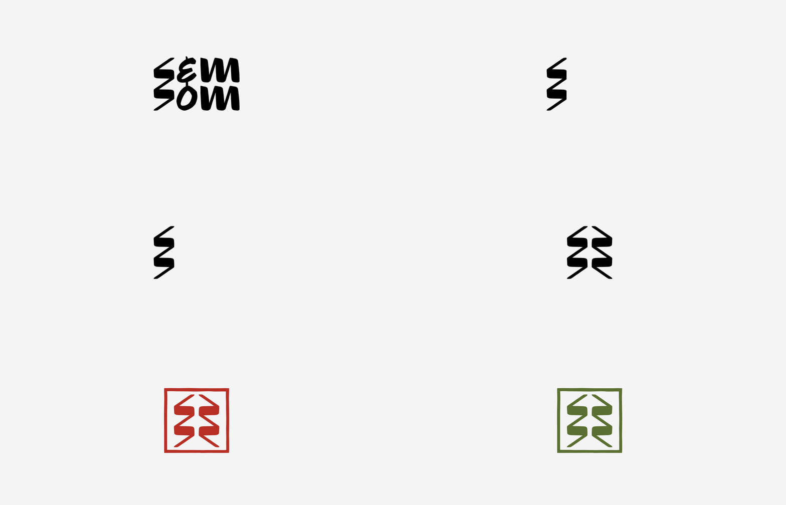
Inspired by the sleek, often geometric islamic calligraphy, we drew a wordmark that can morph into a symbol (representing the libanese cedar). The rugged/handmade finish translates the oriental/homemade feel whilst the geometric grid reminds the calligraphy books.
On the other side, the layout (whitespace) and the use of a Grotesk sans-serif font is a reference to Semsom's European roots.
Implementations
· Strategy
· Visual Identity
· Stationary
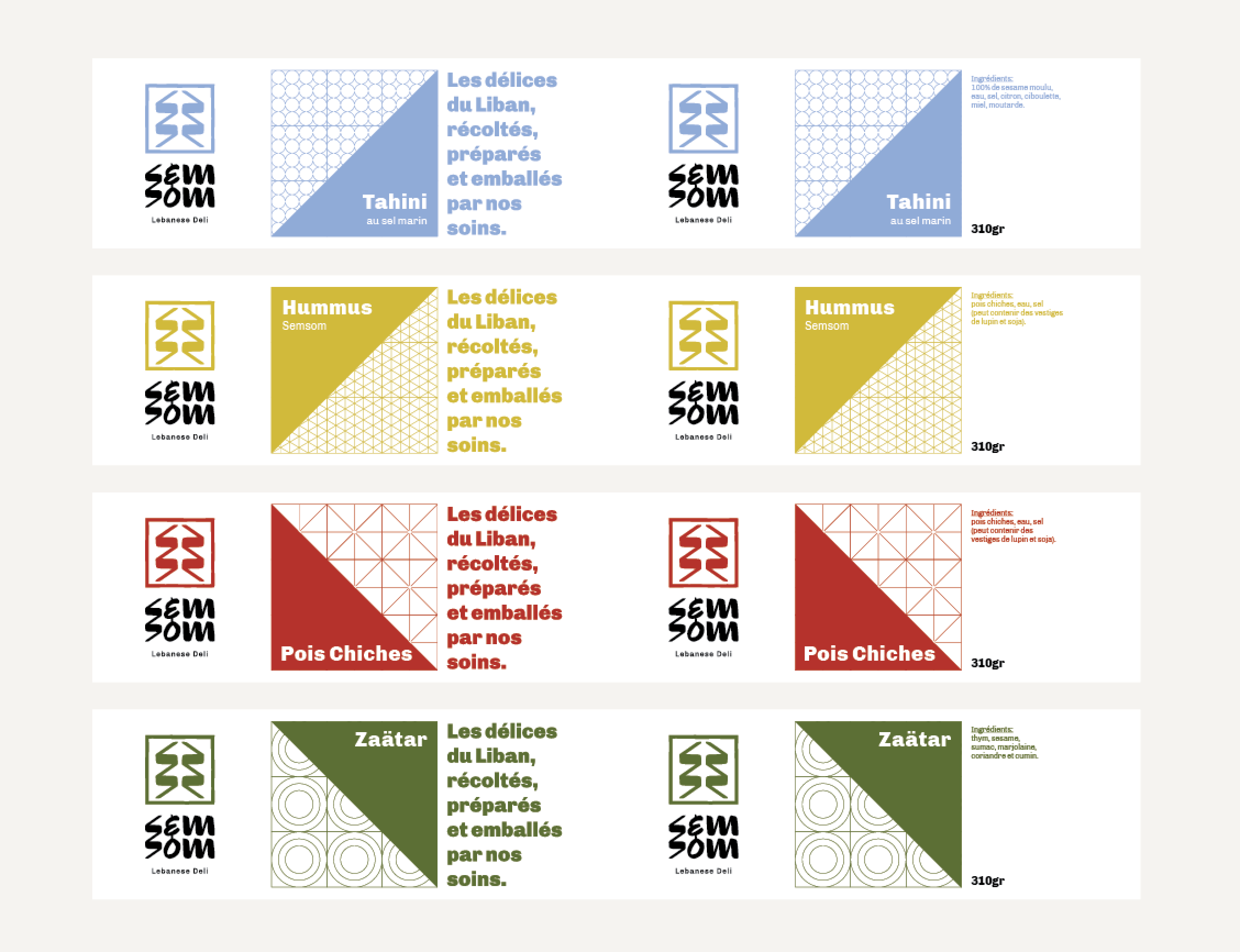
· Packaging
· Newsletter


