About
Client: Sioux productions
Sector: Audiovisual
Type: Producing / Filmmaking
Country: Belgium
Project
Sioux is an audiovisual production company focussing on film and documentaries.
Idea
Playing with the words and the images, that’s what they do… During our first meeting they told us the name of they had chosen for their new company: ‘Sioux’.
At first, that choice of name seemed quite improbable and random… But it has its positives: it’s stands for a well known indian tribe that comes with a certain symbolic strenght attached to it… and it’s short. But in fact, they mainly chose that name because you could play with its secondary reading: Orally ‘Sioux’ sounds also like ‘See You’…
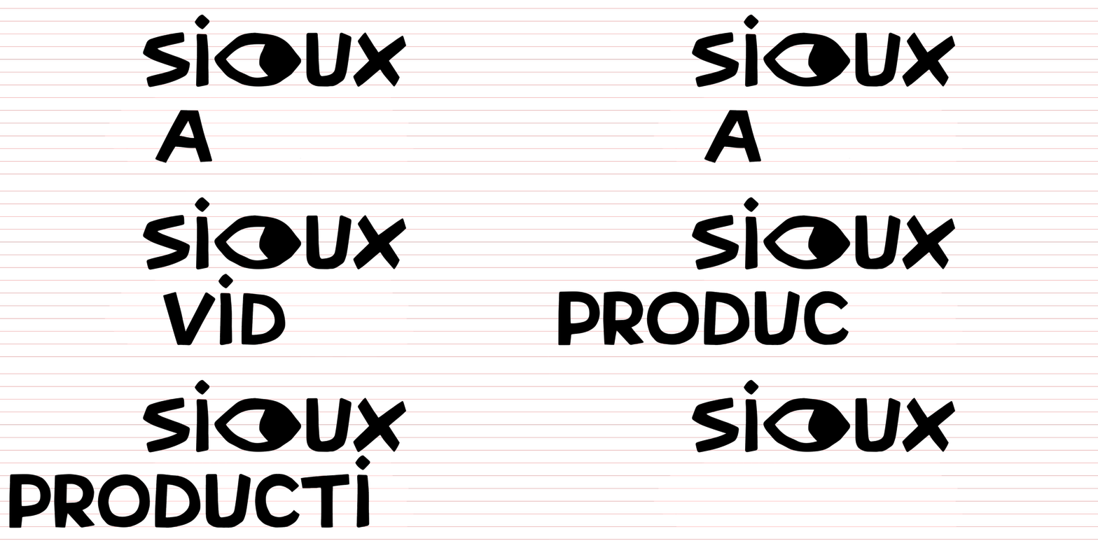
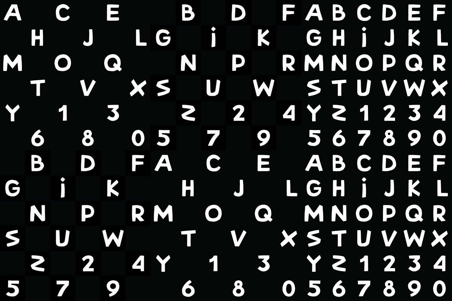
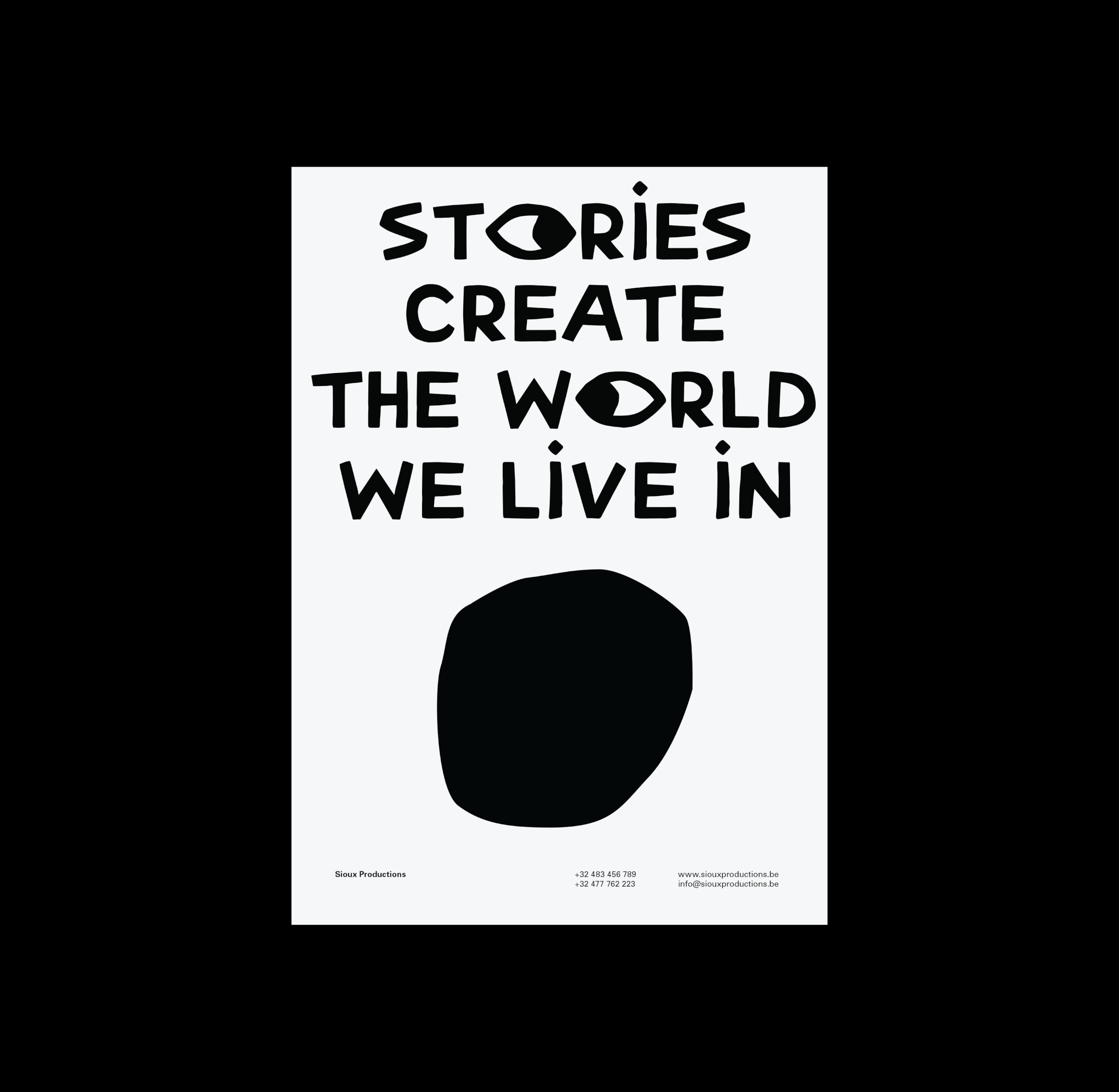
From that standpoint we started developing their symbol: A feather that, when put horizontally, becomes an eye. With its bold, uneven lines, the drawing style of the logo conveys a tribal feel. To support their logotype, we also created a whole alphabet using this particular, bold visual style, allowing them to typographically stand out.
Implementations
· Visual Identity
· Website
Visual identity
Research & Development
Left: Sitting Bull, Famous Sioux
Right: The eye stands for ‘See You’

